Especially useful widgets
Glooey comes with a wide variety of built-in widgets, but you can go a long way with just a few. This tutorial introduces some of the most fundamental widgets to give you a feel for what’s available and how to make GUIs that are more “real” than the Getting started example. These introductions are very brief, but you can find complete documentation for every widget in the API documentation.
Keep in mind that the built-in widgets are unstyled, so they’re all kinda ugly and/or aggressively minimalist 1. Glooey’s philosophy is that subclassing widgets is the easiest and most powerful way to control how they look, so all the built-in widgets try to remain blank slates in terms of style. The Stylizing widgets tutorial has more information on how to change what the built-in widgets look like.
Note
All the examples in this tutorial leave out the code to create the GUI and run the pyglet event loop. Those steps are explained in the Getting started tutorial. If you want to see those steps, you can download the script associated with each example.
Grid — organize widgets
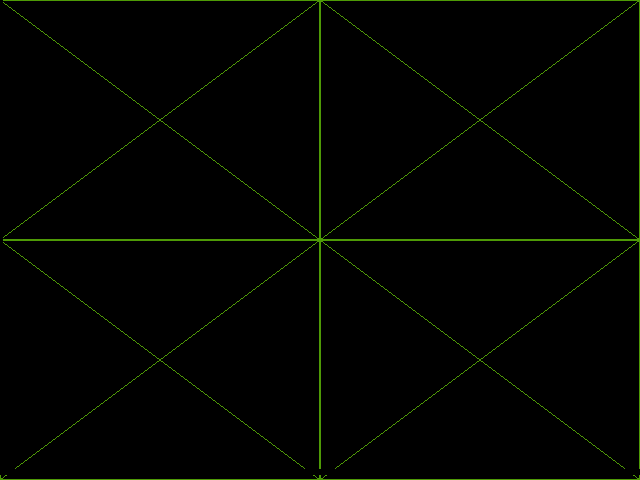
The Grid widget is a container that organizes widgets into
a grid. Along with HBox and VBox, it is one of the most common ways to
control how widgets are arranged:
grid = glooey.Grid()
grid.add(0, 0, glooey.Placeholder())
grid.add(0, 1, glooey.Placeholder())
grid.add(1, 0, glooey.Placeholder())
grid.add(1, 1, glooey.Placeholder())

gui.add(grid)
especially_useful_widgets/grid.pyespecially_useful_widgets/grid_assets.zip
In this example, the grid infers how many rows and columns to make from the
indices provided to the add() calls. You can also explicitly tell
the grid how many rows and columns to make:
# Initialize a grid with 3 rows and 4 columns.
grid = glooey.Grid(3, 4)

# Resize the grid to have 5 rows and 6 columns.
grid.num_rows = 5
grid.num_cols = 6
By default, the grid distributes space evenly between all its rows and columns, but you can also control the size of any row or column. The most common thing to do is to set the size of a row or column to 0 to make it just large enough to fit all its widgets:
grid.set_row_height(1, 0)
grid.set_col_width(1, 0)
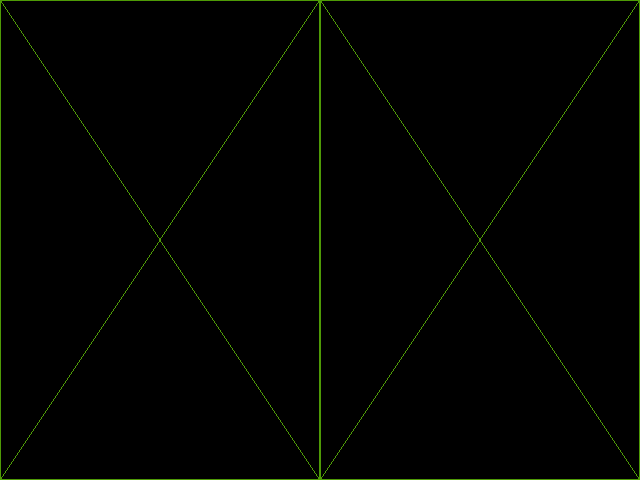
HBox — horizontal layout
HBox arranges widgets horizontally. It’s essentially a simplified Grid with
only one row:
hbox = glooey.HBox()
hbox.add(glooey.Placeholder())
hbox.add(glooey.Placeholder())

gui.add(hbox)
especially_useful_widgets/hbox.pyespecially_useful_widgets/hbox_assets.zip
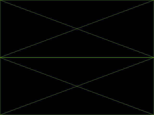
VBox — vertical layout
VBox arranges widgets vertically. It’s essentially a simplified Grid with
only one column:
vbox = glooey.VBox()
vbox.add(glooey.Placeholder())
vbox.add(glooey.Placeholder())

gui.add(vbox)
especially_useful_widgets/vbox.pyespecially_useful_widgets/vbox_assets.zip
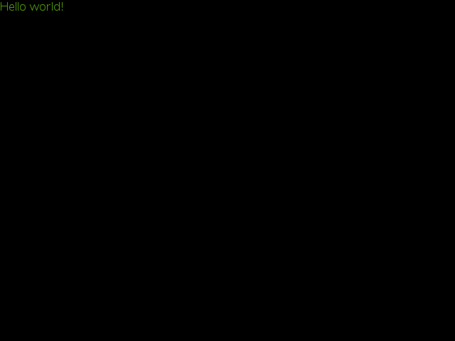
Label — show text
The Label widget displays text:
label = glooey.Label('Hello world!')
gui.add(label)
especially_useful_widgets/label.pyespecially_useful_widgets/label_assets.zip
By default, the label widget will only put line breaks where you tell it to
(i.e. where there are \n characters in the text). However, you can have it
wrap text to fit a particular width by specifying the line_wrap option:
text = "Lorem ipsum dolor sit amet, consectetur adipiscing elit. Nam justo sem, malesuada ut ultricies ac, bibendum eu neque. Lorem ipsum dolor sit amet, consectetur adipiscing elit. Aenean at tellus ut velit dignissim tincidunt.  Curabitur euismod laoreet orci semper dignissim. Suspendisse potenti. Vivamus sed enim quis dui pulvinar pharetra. Duis condimentum ultricies ipsum, sed ornare leo vestibulum vitae. Sed ut justo massa, varius molestie diam. Sed lacus quam, tempor in dictum sed, posuere et diam. Maecenas tincidunt enim elementum turpis blandit tempus. Nam lectus justo, adipiscing vitae ultricies egestas, porta nec diam. Aenean ac neque tortor. Cras tempus lacus nec leo ultrices suscipit. Etiam sed aliquam tortor. Duis lacus metus, euismod ut viverra sit amet, pulvinar sed urna.\n\nAenean ut metus in arcu mattis iaculis quis eu nisl. Donec ornare, massa ut vestibulum vestibulum, metus sapien pretium ante, eu vulputate lorem augue vestibulum orci. Donec consequat aliquam sagittis. Sed in tellus pretium tortor hendrerit cursus congue sit amet turpis. Sed neque lacus, lacinia ut consectetur eget, faucibus vitae lacus. Integer eu purus ac purus tempus mollis non sed dui. Vestibulum volutpat erat magna. Etiam nisl eros, eleifend a viverra sed, interdum sollicitudin erat. Integer a orci in dolor suscipit cursus. Maecenas hendrerit neque odio. Nulla orci orci, varius id viverra in, molestie vel lacus. Donec at odio quis augue bibendum lobortis nec ac urna. Ut lacinia hendrerit tortor mattis rhoncus. Proin nunc tortor, congue ac adipiscing sit amet, aliquet in lorem. Nulla blandit tempor arcu, ut tempus quam posuere eu. In magna neque, venenatis nec tincidunt vitae, lobortis eget nulla."
label = glooey.Label(text, line_wrap=640)
gui.add(label)
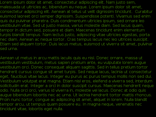
especially_useful_widgets/wrapped_label.pyespecially_useful_widgets/wrapped_label_assets.zip
This feature has one big caveat: the text will not fill more than the specified width, even if there is free space available to it. In other words, there’s no way to say “wrap to fill the whole screen”. Instead, like in this example, you have to say something like “wrap to fill 640 px”. This caveat is due to a limitation in how glooey assigns space to widgets 2.
Background — tile images
The Background widget fills in space using tiled images.
You can think of it like a picture frame: you specify images for the corners
and edges, and it tiles the edges to fill in all the space it needs to.
bg = glooey.Background()
bg.set_appearance(
        center=pyglet.resource.texture('center.png'),
        top=pyglet.resource.texture('top.png'),
        bottom=pyglet.resource.texture('bottom.png'),
        left=pyglet.resource.texture('left.png'),
        right=pyglet.resource.texture('right.png'),
        top_left=pyglet.resource.texture('top_left.png'),
        top_right=pyglet.resource.texture('top_right.png'),
        bottom_left=pyglet.resource.texture('bottom_left.png'),
        bottom_right=pyglet.resource.texture('bottom_right.png'),
)
gui.add(bg)
especially_useful_widgets/background.pyespecially_useful_widgets/background_assets.zip
This example doesn’t adequately reflect how flexible the background widget is. In addition to what you see above, it can:
Grow horizontally or vertically or in both directions
Accommodate any combination of edge, corner, and center images
Use solid colors to make fills and outlines
But the true power of the background widget is how easily it can be customized
and incorporated into other widgets. Those topics are beyond the scope of this
tutorial, but it’s worth mentioning that you should very rarely need to use the
set_appearance() method. See the
tutorials on Stylizing widgets and Composing widgets for more details.
The caveat with the background widget is that the images you give it must fill
their whole textures in the dimensions being tiled. Usually this means images
with power-of-two sizes (e.g. 16, 32, 64 px) that were loaded using
pyglet.resource.texture(). The reason for this caveat is that the
background widget tiles images by manipulating their texture coordinates. This
approach is very efficient, but it doesn’t work if the image is loaded into a
texture with extra space around the edges.
Button — react to clicks
The Button widget can display text or images, and can also have a rollover
background. You can tell when the button has been clicked because it will emit
an on_click event via the event framework provided by pyglet. In this
example, we connect the event to a simple handler that just prints a message to
stdout. The event has one argument, which is the widget that generated the it:
button = glooey.Button("Click here!")
button.push_handlers(on_click=lambda w: print(f"{w} clicked!"))
gui.add(button)

especially_useful_widgets/button.pyespecially_useful_widgets/button_assets.zip
- 1
You might wonder why all the built-in widgets are green by default. This is because they have to be some color, and green shows up well against both dark and light backgrounds.
- 2
Wrapped text is unique in that it’s height depends on its width. The limitation in question is that glooey assigns width and height to widgets in one step, so wrapped text never get an opportunity to update its height to reflect to the full width made available to it. That said, assigning space like this isn’t a problem for any other widget, and it keeps the repacking framework nice and simple, so I’m not sure whether or not it’ll be fixed.