Padding, alignment, and size hints
The focus of this tutorial is on fine-tuning the size, shape, and position of widgets. The title gives away the three mechanisms for doing this: you can use padding to control the amount of space around a widget, alignment to control where a widgets goes within the space allocated for it, and size hints to control how big a widget is.
In order to explain these concepts in more detail, it will be helpful to establish some terminology. Each widget is assigned (by its parent) a rectangle specifying the maximum amount of space it can occupy. We’ll call this the “max rect”. Each widget also internally keeps track of the minimum amount space it needs for itself and its children. We’ll call this the “min rect”. These two rectangles are illustrated below:
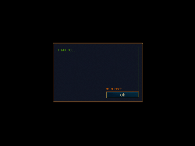
padding_alignment_size_hints/ok_dialog.pypadding_alignment_size_hints/ok_dialog_assets.zip
In this example, an “Ok” button is positioned near the bottom right corner of a dialog box. The button’s min rect (orange) is the same size as the images comprising the button, which makes sense. The button’s max rect (green) — which is set by the dialog box — is a little smaller than the dialog’s background image. This keeps the button from getting too close the edges of the dialog box.
Glooey guarantees that each widget will get at least as much space as it needs. In other words, the max rect will always be as big or bigger than the min rect. If this is not possible (i.e. if the screen isn’t big enough to fit all the widgets), glooey will throw an exception.
Padding
Padding creates space around a widget. More precisely, it determines how close a widget can get to the edges of its max rect. The most common way to set the padding is to use custom attributes:
class MyPlaceholder(glooey.Placeholder):
    custom_padding = 10
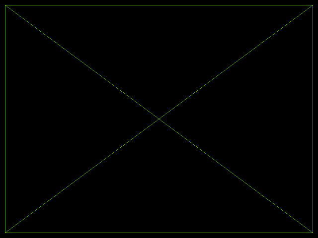
In this example, the placeholder is being added directly to the gui, so the max rect is the whole screen. The min rect is actually zero by zero, because placeholders don’t intrinsically need any space, but they’re configured to take up as much space as they can. The padding keeps the placeholder 10 px away from the edge of the screen.
You can also set the padding using normal attributes, and you can set different paddings for each side of the widget. The pseudocode below highlights all these attributes:
class MyPlaceholder(glooey.Placeholder):
    custom_padding = ...
    custom_horz_padding = ...
    custom_vert_padding = ...
    custom_top_padding = ...
    custom_bottom_padding = ...
    custom_left_padding = ...
    custom_right_padding = ...

widget = MyPlaceholder()
widget.padding = ...
widget.horz_padding = ...
widget.vert_padding = ...
widget.top_padding = ...
widget.bottom_padding = ...
widget.left_padding = ...
widget.right_padding = ...
The Grid, HBox, and VBox widgets use the padding attribute to
determine how much space to put between their cells. They also have a
cell_padding attribute (not shown in this example) that controls
inter-cell spacing without affecting normal padding:
grid = glooey.Grid(2, 2)
grid.padding = 10

grid.add(0, 0, glooey.Placeholder())
grid.add(0, 1, glooey.Placeholder())
grid.add(1, 0, glooey.Placeholder())
grid.add(1, 1, glooey.Placeholder())
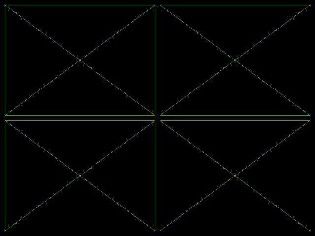
The example is somewhat conceptually different from the first one in that the grid is using padding to make smaller max rects for its placeholder children. Each child is still filling its entire max rect. In the first example, the placeholder was using padding to stay away from edges of its max rect.
Alignment
Alignment determines the position and size of a widget within its max rect. You can specify an alignment either as a string or a function. The following strings are understood by default:
fillMake the widget fill the entire space available to it.
fill horzMake the widget as wide and as short as possible, and put in the middle of the space available to it.
fill vertMake the widget as tall and as narrow as possible, and put in the middle of the space available to it.
fill topMake the widget as wide and as short as possible, and put it at the top of the space available to it.
fill bottomMake the widget as wide and as short as possible, and put it at the bottom of the space available to it.
fill leftMake the widget as tall and as narrow as possible, and put it on the left of the space available to it.
fill rightMake the widget as tall and as narrow as possible, and put it on the right of the space available to it.
top leftMove the widget to the top left corner of the space available to it, and keep it as small as possible.
topMove the widget to the center of the top edge of the space available to it, and keep it as small as possible.
top rightMove the widget to the top right corner of the space available to it, and keep it as small as possible.
leftMove the widget to the center of the left edge of the space available to it, and keep it as small as possible.
centerMove the widget to the center of the space available to it, and keep it as small as possible.
rightMove the widget to the center of the right edge of the space available to it, and keep it as small as possible.
bottom leftMove the widget to the bottom left corner of the space available to it, and keep it as small as possible.
bottomMove the widget to the center of the bottom edge of the space available to it, and keep it as small as possible.
bottom rightMove the widget to the bottom right corner of the space available to it, and keep it as small as possible.
class MyPlaceholder(glooey.Placeholder):
    custom_alignment = 'center'

widget = MyPlaceholder(300, 200)
gui.add(widget)
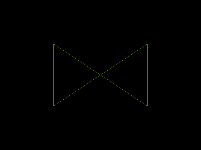
Note that we specified a size for our placeholder (300x200) by passing arguments to its constructor. If we hadn’t done this, our placeholder would’ve been 0x0 and we wouldn’t have been able to see it. We haven’t had to do this before because the default alignment for placeholders is “fill”, so they take up any space available to them. But here we changed the alignment to “center”, so the size of the widget matters.
As with padding, you can set a widget’s alignment using normal attributes as well as custom attributes. Both uses are common:
widget = MyPlaceholder(300, 200)
widget.alignment = 'center'
gui.add(widget)
You can also align a widget using a custom-written function. The function
should take two arguments. The first is the min rect and the second is the max
rect (both are vecrec.Rect instances). The function should modify the first
argument (which really represents the widget being aligned) in place to
position it somewhere within the max rect:
def fill_70(widget_rect, max_rect):
    """
    Make the widget take up 70% of the space available to it in both
    dimensions, and center align it.
    """
    widget_rect.width = 0.7 * max_rect.width
    widget_rect.height = 0.7 * max_rect.height
    widget_rect.center = max_rect.center

widget.alignment = fill_70
Size hints
You can use size hints to control how big a widget is. More specifically, a widget’s min rect must be at least as big as its size hint, so you can use size hints to make a widget bigger than it would be otherwise. You can’t use size hints to make a widget smaller, because that would undermine the guarantee that widgets will always have enough space to render themselves and their children. Here’s an example showing how to give a size hint using custom attributes:
class MyPlaceholder(glooey.Placeholder):
    custom_size_hint = 300, 200  # width, height
    custom_alignment = 'center'

widget = MyPlaceholder()
gui.add(widget)

You can see that the placeholder is 300x200. We had to center-align the widget to prevent it from filling up the whole window (the default alignment for placeholders is “fill”), in which case the size hint wouldn’t have mattered.
You may have noticed that we achieved the same effect (i.e. setting the size of a placeholder) in the alignment demo by passing width and height arguments to the placeholder’s constructor. I don’t want this to cause any confusion, so I want to emphasize that the alignment demo was only possible because the placeholder widget is specifically written to accept those size arguments. Most other widgets aren’t and can only be resized using size hints.
As with padding, you can give widgets a size hint using normal attributes as well as custom attributes. You can also give hints for just the width or the height without affecting the other dimension. The following pseudocode demonstrates this usage:
class MyPlaceholder(glooey.Placeholder):
    custom_size_hint = ...
    custom_width_hint = ...
    custom_height_hint = ...

widget = MyPlaceholder()
widget.size_hint = ...
widget.width_hint = ...
widget.height_hint = ...