Stylizing widgets
Now that we know how to use a few basic widgets, we need to know how to customize their appearance and behavior. In the most general sense, you do this by subclassing each widget you want to customize. For example, if you were making a Pong GUI, you would probably end up defining some sort of retro/arcade style in classes like these:
class PongLabel(glooey.Label):
    ...

class PongButton(glooey.Button):
    ...
There are several advantages to stylizing widgets by subclassing them like this. First, it’s very easy to create multiple variants of the same widget type. This comes in handy because most GUIs need several different kinds of button, header and body text, heavier and lighter borders or frames, etc. Second, subclassing does a great job of making the simple customizations easy (because superclasses can anticipate and facilitate common tweaks) and the complex ones possible (because subclasses can override any aspect of their base class).
This tutorial focuses on the simplest and easiest customizations, which typically amount to changing the appearance of existing widgets. The Composing widgets and Making widgets from scratch tutorials will cover more powerful ways to customize widgets.
Note
These tutorials will use the Wesnoth theme as an example. Wesnoth is a popular open-source, fantasy-themed, turn-based strategy game. Although Wesnoth itself does not use glooey, recapitulating parts of its user interface is a good real-world demonstration of what glooey can do.
“Custom” attributes
The easiest way to stylize a widget is to override its “custom” attributes.
These are class-wide attributes — conventionally prefixed with custom_
— that control basic properties like colors, images, fonts, etc. The label
widget is a good example:
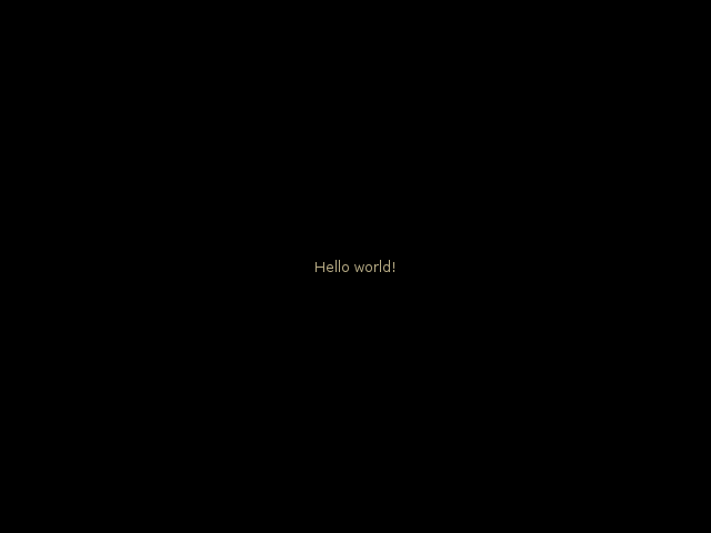
class WesnothLabel(glooey.Label):
    custom_font_name = 'Lato Regular'
    custom_font_size = 10
    custom_color = '#b9ad86'
    custom_alignment = 'center'

label = WesnothLabel('Hello world!')
gui.add(label)
stylizing_widgets/label.pystylizing_widgets/label_assets.zip
Here custom_font_name, custom_font_size, custom_colors, and
custom_alignment are all attributes defined in the Label class (or one of
its superclasses) for the explicit purpose of being overridden in subclasses.
The Label class has a lot more of these attributes too, check the API
documentation for a complete list.
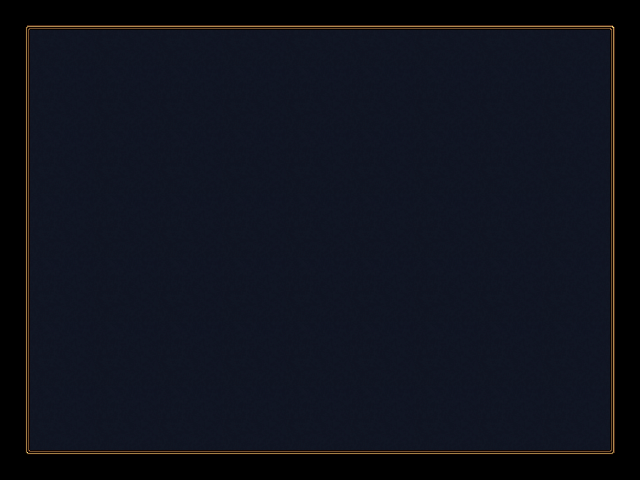
The background widget is another good example. The more idiomatic way to write the demo from the Especially useful widgets tutorial is like this:
class WesnothBorder(glooey.Background):
    custom_center = pyglet.resource.texture('center.png')
    custom_top = pyglet.resource.texture('top.png')
    custom_bottom = pyglet.resource.texture('bottom.png')
    custom_left = pyglet.resource.texture('left.png')
    custom_right = pyglet.resource.texture('right.png')
    custom_top_left = pyglet.resource.image('top_left.png')
    custom_top_right = pyglet.resource.image('top_right.png')
    custom_bottom_left = pyglet.resource.image('bottom_left.png')
    custom_bottom_right = pyglet.resource.image('bottom_right.png')

border = WesnothBorder()
gui.add(border)
stylizing_widgets/background.pystylizing_widgets/background_assets.zip
Inner classes
It’s also common to stylize widgets with other widgets. For example, you can stylize the button widget by providing different widgets for the label and the various mouse rollover states. The syntax for doing this is analogous to the “custom” attributes defined above: just override a class variable with the widget class you want to use. The trick is that you can also create that widget class in place (i.e. by defining an inner class). This provides a very succinct way to customize composite widgets:
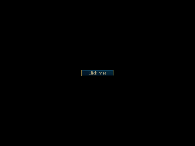
class WesnothButton(glooey.Button):
    Foreground = WesnothLabel

    class Base(glooey.Image):
        custom_image = pyglet.resource.image('base.png')

    class Over(glooey.Image):
        custom_image = pyglet.resource.image('over.png')

    class Down(glooey.Image):
        custom_image = pyglet.resource.image('down.png')

button = WesnothButton('Click me!')
gui.add(button)
stylizing_widgets/button.pystylizing_widgets/button_assets.zip
The WesnothButton class in this example has four widget classes being
overridden: Foreground, Base, Over,
Down. The first is used to display whatever is in the foreground of
the button. Typically this is either a Label or an Image, but it could be
anything (e.g. an HBox that puts a label next to an image). The remaining
overridden classes are used to display different background images in the
different rollover states.
This example shows off both ways of using widgets to define style. The
Foreground attribute is directly set to an existing widget class.
The WesnothLabel widget we created earlier in this tutorial already has the
style we want for this button, so it’s nice that we can simply reuse it here.
The Base, Over, and Down attributes are
overridden by new widget classes defined in place. These background images
aren’t useful outside the button, so it’s nice that we don’t have to define
them separately.
This is the first time we’ve seen the Image widget, but hopefully it’s not
too hard to understand. It just displays the image specified by
custom_image. It’s perhaps more common to derive Base,
Over, and Down from Background (which allows the button
to grow and shrink with the text), but we use Image here because the Wesnoth
theme has fixed-size buttons.
Note
Because specifying rollover images for buttons is a very common task, the
Button class actually provides a more succinct way to accomplish it:
 class WesnothButton(glooey.Button):
     Foreground = WesnothLabel
     Background = glooey.Image

     custom_base_image = pyglet.resource.image('base.png')
     custom_over_image = pyglet.resource.image('over.png')
     custom_down_image = pyglet.resource.image('down.png')
The Background class is used for all the rollover states. If you
want, you can override Background for specific rollover states by
also specifying Base, Over, or Down. The
default Background class is glooey.Background, but
here we change it to glooey.Image.
The custom_base_image attribute is equivalent to the
custom_image attribute in the background widget for the
Base state, which in this example is Image. This is a little bit
magical: the button basically finds any attributes matching
custom_base_*, renames them to custom_*, then provides them to the
Base background class. In this way, any custom attributes provided
by any of the background classes are mirrored in the button class itself.