More useful widgets
Now that we’ve seen how all the basic widget customizations work, we can introduce some of the widgets that really rely on those customizations.
Frame — pretty outlines
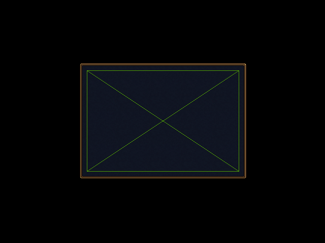
The purpose of the Frame widget is to put a nice border around another
widget. It achieves this effect by delegating to two inner classes:
Decoration and Box.
Decoration is responsible for drawing the border. There’s no actual widget
called “Decoration”, that’s just the name of the inner class you have to
provide. Any widget can be the decoration, but Background and Image are
the most common choices.
Box is responsible for containing the widget (or widgets) that will go in
the frame. This usually means setting a padding to keep the contents of the
frame far enough away from it border. Once again, there’s no actual widget
called box, but the box is almost always a Bin. We haven’t talked about
Bin before, but it’s just a simple container that holds one widget at a time.
It’s possible to make the box any kind of container you want – sometimes
Grid is useful for highly structured frames – but you’ll probably have to
override the add() and clear() methods of your subclass to make them do
something reasonable.
Those last two paragraphs were a little abstract, so hopefully an example will make things more concrete:
class WesnothFrame(glooey.Frame):

    class Decoration(glooey.Background):
        custom_center = pyglet.resource.texture('center.png')
        custom_top = pyglet.resource.texture('top.png')
        custom_bottom = pyglet.resource.texture('bottom.png')
        custom_left = pyglet.resource.texture('left.png')
        custom_right = pyglet.resource.texture('right.png')
        custom_top_left = pyglet.resource.image('top_left.png')
        custom_top_right = pyglet.resource.image('top_right.png')
        custom_bottom_left = pyglet.resource.image('bottom_left.png')
        custom_bottom_right = pyglet.resource.image('bottom_right.png')

    class Box(glooey.Bin):
        # These paddings are asymmetric because the border images have a
        # 3px shadow on the bottom left side, although you can't see it
        # on a black background.
        custom_right_padding = 14
        custom_top_padding = 14
        custom_left_padding = 17
        custom_bottom_padding = 17

frame = WesnothFrame()
frame.add(glooey.Placeholder(300, 200))
gui.add(frame)
more_useful_widgets/frame.pymore_useful_widgets/frame_assets.zip
Notice that the padding we specified for the bin keeps the placeholder an appropriate distance from the edge of the frame.
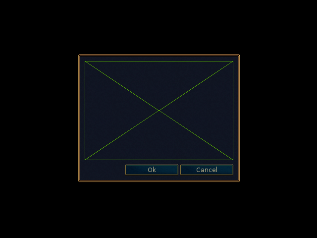
Dialog — popup messages
Dialog boxes are widgets that appear with a brief message or question for the
user, and disappear when the user clicks a button to acknowledge the message or
answer the question. There are two dialog box widgets provided by glooey:
OkDialog and YesNoDialog. The former comes with a single button that
simply closes the dialog. The latter comes with two buttons that both close
the dialog, but it remembers which one was clicked. There are also a few
dialog superclasses that you can use if you want even more buttons, but those
are beyond the scope of this tutorial.
Dialog boxes are configured much like frames, but there are a few differences
to be aware of. First, the Box inner class must be a Grid 1 because
the dialog needs a grid to position its buttons relative to its content.
Second, there is an inner class called Buttons that you can use to control
the alignment and padding of the buttons in the dialog box. Typically
Buttons is an HBox, but anything with an add() method will work.
Third, there are inner classes for each button in the dialog box. For
OkDialog, this is OkButton; for YesNoDialog, this is YesButton and
NoButton. Finally, unlike every other widget, dialog boxes do not need to be
added to a parent widget. Instead, they are displayed by calling their
open() method with the root GUI widget as the argument.
This example shows how to use YesNoDialog:
class WesnothDialog(glooey.YesNoDialog):

    class Decoration(glooey.Background):
        custom_center = pyglet.resource.texture('center.png')
        custom_top = pyglet.resource.texture('top.png')
        custom_bottom = pyglet.resource.texture('bottom.png')
        custom_left = pyglet.resource.texture('left.png')
        custom_right = pyglet.resource.texture('right.png')
        custom_top_left = pyglet.resource.image('top_left.png')
        custom_top_right = pyglet.resource.image('top_right.png')
        custom_bottom_left = pyglet.resource.image('bottom_left.png')
        custom_bottom_right = pyglet.resource.image('bottom_right.png')

    class Box(glooey.Grid):
        custom_right_padding = 14
        custom_top_padding = 14
        custom_left_padding = 17
        custom_bottom_padding = 17
        custom_cell_padding = 9

    class Buttons(glooey.HBox):
        custom_cell_padding = 3

    class YesButton(WesnothButton):
        custom_text = 'Ok'

    class NoButton(WesnothButton):
        custom_text = 'Cancel'

dialog = WesnothDialog()
dialog.add(glooey.Placeholder(300, 200))
dialog.open(gui)
more_useful_widgets/dialog.pymore_useful_widgets/dialog_assets.zip
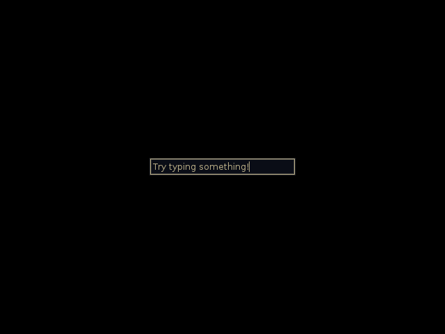
Form — text input
The Form widget allows users to provide text input. It has three inner
classes you can customize: Label, Base, and Focused. Label
draws the text and – this is a little bit of a gotcha – should inherit from
EditableLabel (not Label). Base draws the form when it doesn’t have
focus, and Focused draws it when it does. These two inner classes usually
inherit from Background or Image. Focused is optional. If you don’t
provide it, the form will just stay in its base state all the time. You can
use the form’s on_unfocus event in conjunction with the its text property
to get the string the user entered:
class WesnothForm(glooey.Form):
    custom_alignment = 'center'

    class Label(glooey.EditableLabel):
        custom_font_name = 'Lato Regular'
        custom_font_size = 10
        custom_color = '#b9ad86'
        custom_alignment = 'top left'
        custom_horz_padding = 5
        custom_top_padding = 5
        custom_width_hint = 200

    class Base(glooey.Background):
        custom_center = pyglet.resource.texture('form_center.png')
        custom_left = pyglet.resource.image('form_left.png')
        custom_right = pyglet.resource.image('form_right.png')

form = WesnothForm()
form.push_handlers(on_unfocus=lambda w: print(f"Form input: '{w.text}'"))
gui.add(form)
more_useful_widgets/form.pymore_useful_widgets/form_assets.zip
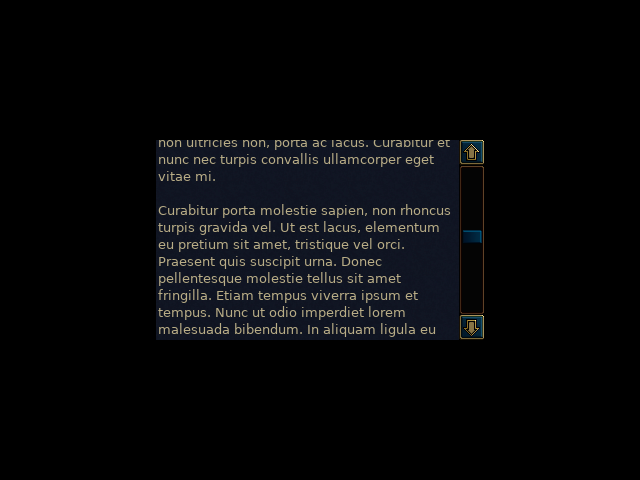
ScrollBox — fit large content
The ScrollBox widget allows the user to scroll around a widget that might
otherwise be too large to fit in the GUI. It has a number of different parts
(the background, the scroll bars, the scroll grips, etc) and each one can be
configured with a different inner class:
Frame: This inner class controls the background and padding for the actual content being scrolled. As the name implies, it typically inherits fromFrame.VBar: This inner class is responsible for the vertical scroll bar. It inherits fromVScrollBarand contains the following inner classes and custom attributes:Decoration: The background of the scroll bar, which typically inherits from Background. Note that this background extends behind the forward and backward buttons (if they are present), so you may need to add a padding to get the background to line up with the region the grip can move in.Forward: The button that will scroll “forward” (down for a vertical scroll bar, right for a horizontal one). This inner class typically inherits fromButton.Backward: The same as forward, but for scrolling in the other direction.Grip: The button that you can click on and drag around to scroll. This inner class typically inherits from eitherButton(if you want to react to mouse hovers and clicks) orImageorBackground(if you don’t).custom_scale_grip: If true, the size of the scroll grip will be proportional to the fraction of the content that is currently visible. Note that the effect will not work right unless the grip class is able to expand vertically. This requires that its alignment be'fill'and that it usesBackground(either directly or viaButton).
Note
If no
VBarinner class is specified, the scroll box will not be scrollable in the vertical direction. Likewise forHBarand horizontal scrolling. Therefore, a class that inherits fromScrollBoxbut that doesn’t implement eitherHBarorVBarwill not actually be scrollable. This is an easy mistake to make.Note
If you want to have both vertical and horizontal scroll bars: put all your customizations in a common class that doesn’t inherit from any widget, then use multiple inheritance to derive
HBarandVBarclasses that derive from both the common class and eitherHScrollBarorVScrollBar.HBar: This inner class is responsible for the horizontal scroll bar. It’s pretty much identical toVBar, but it inherits fromHScrollBar.Corner: This inner class fills in the space created by the two scroll bars in the bottom right corner of the scroll box. It typically inherits fromImage, and it will only be displayed if there are two scroll bars.
class WesnothScrollBox(glooey.ScrollBox):
    custom_alignment = 'center'
    custom_height_hint = 200

    class Frame(glooey.Frame):

        class Decoration(glooey.Background):
            custom_center = pyglet.resource.texture('center.png')

        class Box(glooey.Bin):
            custom_horz_padding = 2

    class VBar(glooey.VScrollBar):
        custom_scale_grip = True

        class Decoration(glooey.Background):
            custom_top = pyglet.resource.image('bar_top.png')
            custom_center = pyglet.resource.texture('bar_vert.png')
            custom_bottom = pyglet.resource.image('bar_bottom.png')
            custom_vert_padding = 25

        class Forward(glooey.Button):
            custom_base_image = pyglet.resource.image('forward_base.png')
            custom_over_image = pyglet.resource.image('forward_over.png')
            custom_down_image = pyglet.resource.image('forward_down.png')

        class Backward(glooey.Button):
            custom_base_image = pyglet.resource.image('backward_base.png')
            custom_over_image = pyglet.resource.image('backward_over.png')
            custom_down_image = pyglet.resource.image('backward_down.png')

        class Grip(glooey.Button):
            custom_height_hint = 20
            custom_alignment = 'fill'

            custom_base_top = pyglet.resource.image('grip_top_base.png')
            custom_base_center = pyglet.resource.texture('grip_vert_base.png')
            custom_base_bottom = pyglet.resource.image('grip_bottom_base.png')

            custom_over_top = pyglet.resource.image('grip_top_over.png')
            custom_over_center = pyglet.resource.texture('grip_vert_over.png')
            custom_over_bottom = pyglet.resource.image('grip_bottom_over.png')

            custom_down_top = pyglet.resource.image('grip_top_down.png')
            custom_down_center = pyglet.resource.texture('grip_vert_down.png')
            custom_down_bottom = pyglet.resource.image('grip_bottom_down.png')

scroll = WesnothScrollBox()
scroll.add(WesnothLoremIpsum())
gui.add(scroll)
more_useful_widgets/scroll_box.pymore_useful_widgets/scroll_box_assets.zip
- 1
Strictly speaking, the
Boxinner class only needs to be aGridif you’re inheriting fromButtonDialogor one of its subclasses (which includeOkDialogandYesNoDialog). It can be whatever you want if you’re directly inheriting fromDialog.